🤖 DataRobot 10x Data Science Academy
After learning to train machine learning models at Lambda School, I was seriously impressed with DataRobot's AutoML platform. The clips below walk through how I used it in the inaugural academy cohort.
After learning to train machine learning models at Lambda School, I was seriously impressed with DataRobot's AutoML platform. The clips below walk through how I used it in the inaugural academy cohort.

As a member of the inaugural DataRobot 10x Data Science Academy cohort, I learned to solve data science problems faster with DataRobot's automated machine learning (AutoML) platform — from exploratory analysis through deployment and explainability.
DataRobot Platform (AutoML, model blueprints, validation, What-If / deployment dashboards)
Three builds: Stack Overflow developer salaries, vehicle fuel efficiency (MPG), and county-level COVID spread. Each paired domain questions with feature importance, blueprints, lift curves, and dashboards.
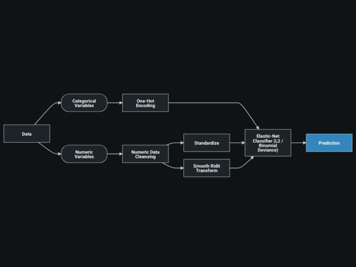
Interpreting models (not just accuracy), comparing blueprints, and using DataRobot's visuals — feature effects, correlation maps, and deployed What-If tools — to explain predictions to a stakeholder.
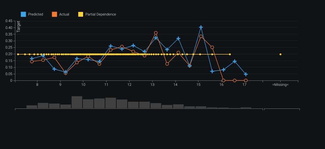
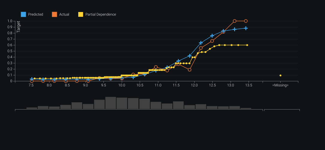
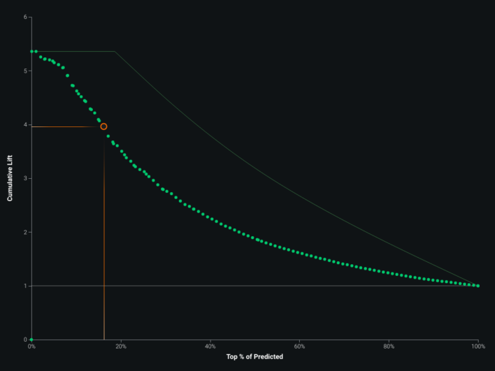
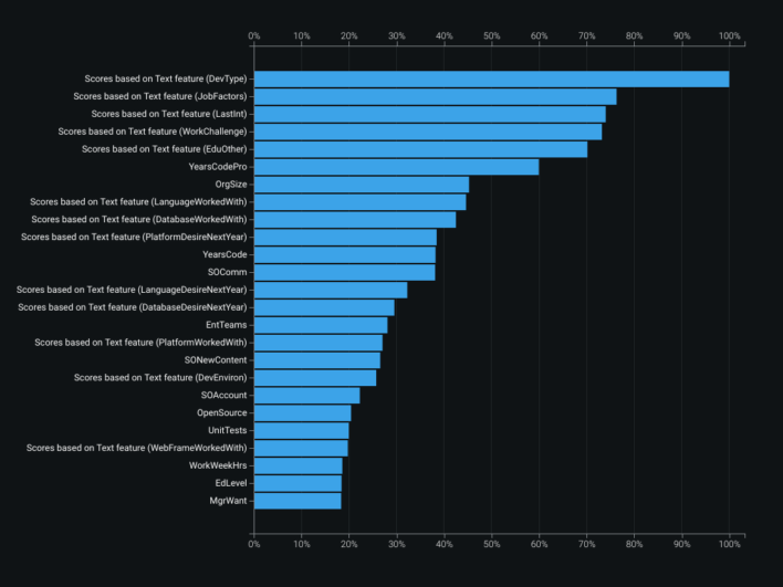
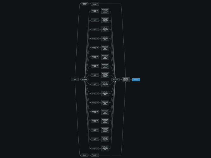
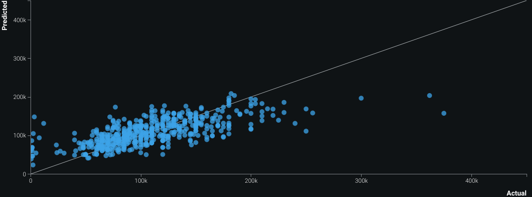
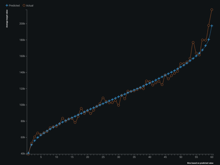
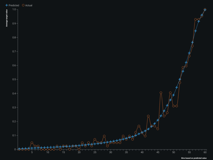
Feature importances highlighted developer role type as a strong driver of salary. The blueprint showed extensive text features numerically encoded during prep. Validation plots revealed the model tended to over-predict at higher salaries and under-predict at lower ones; lift and predicted-vs-actual views made that easy to see. The feature importance map also surfaced correlation clusters among non-white features — especially oranges and greens. The built-in What-If dashboard supported interactive salary predictions from the trained model.
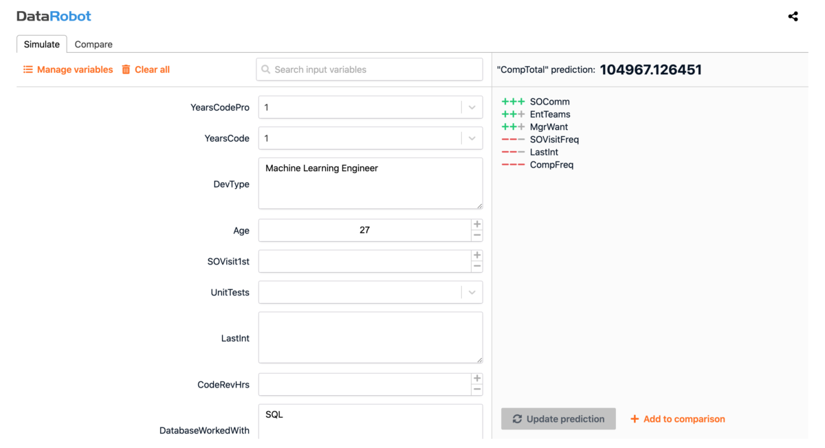
The same deployment path that worked for exploration also supported stakeholder-facing explanations: adjust inputs, compare scenarios, and keep the model’s behavior inspectable.
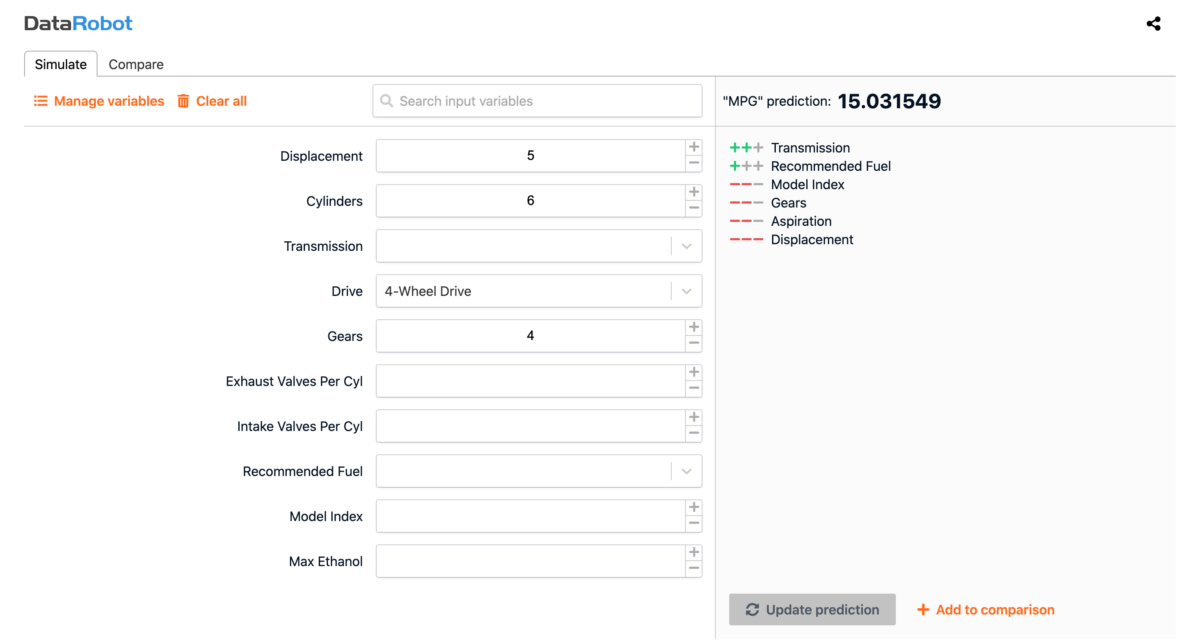
This workflow predicts miles-per-gallon from mechanical specs. As more manufacturers move to EVs, a miles-per-kWh model would lean on physics — weight and aerodynamics — rather than cylinders, transmissions, or ethanol-heavy fields from classic MPG datasets. Design-stage simulation can answer many of those questions before hardware exists.
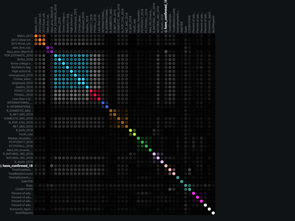
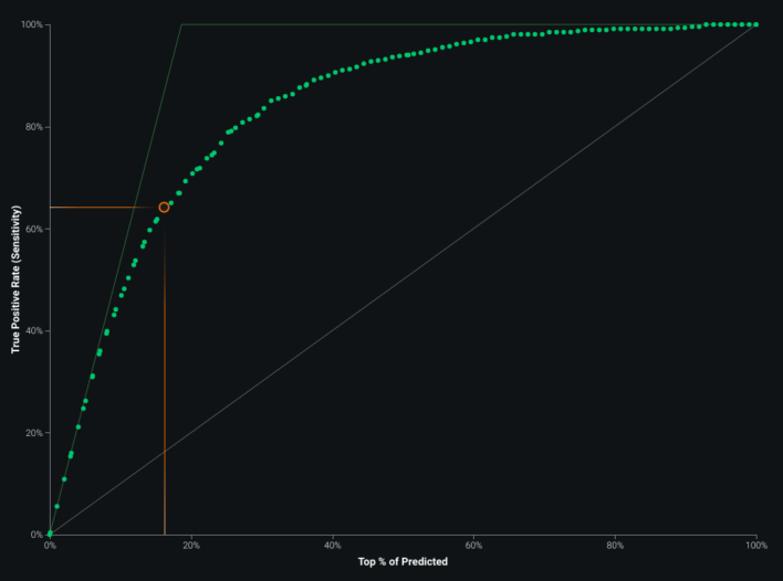
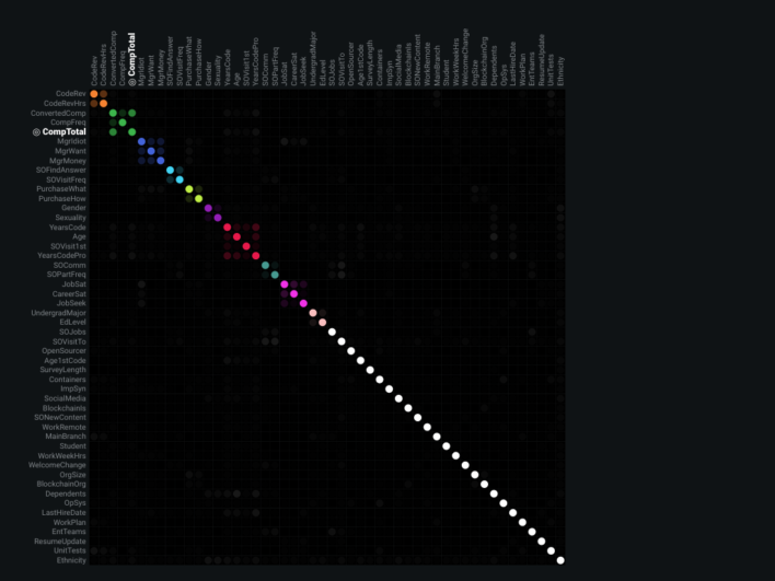
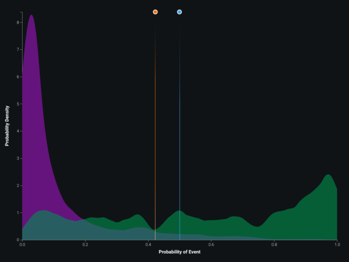
ROC, coefficients, blueprint, and lift views supported iteration on the county infection model. Multicollinearity does not always hurt accuracy, but it can blur interpretability of individual correlated features — the correlation map below shows twelve distinct correlation clusters. Partial dependence–style feature effect plots and gain / cumulative lift charts rounded out validation.
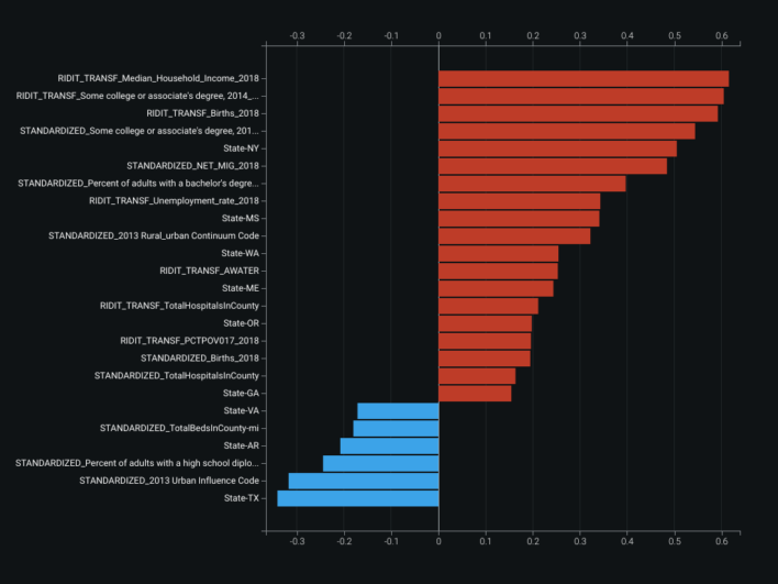
Multicollinearity among features does not necessarily reduce model accuracy, but it can reduce how clearly you can attribute effects to individual correlated inputs — worth inspecting before presenting coefficients to others.
Feature correlation map: twelve correlation clusters across inputs.